
 With a little know-how, colorful fall pictures can be made even better.
Well, for those of us living in the Northern Hemisphere, it's been fall for almost a week now. For those of us living in certain areas of the world, fall means colorful foliage.
So how to get the most out of your fall pictures?
For one thing, shoot your camera using the RAW format. Yes, JPEG allows for some color-related editing, but with RAW, the number of ways to tweak the colors increases dramatically, as does the ease of doing so. Yes, RAW mandates post-processing, but in the end, many people who are serious about their digital pictures will agree with me that RAW rules.
AUTHOR'S NOTE :For the examples and screen shots that follow, I am using Canon's Digital Photo Professional (DPP) RAW editing software that came bundled with my EOS 30D. If you shoot something else, your RAW editor will be different, but the overall functions should remain the same.
Onto making your colors “pop.”
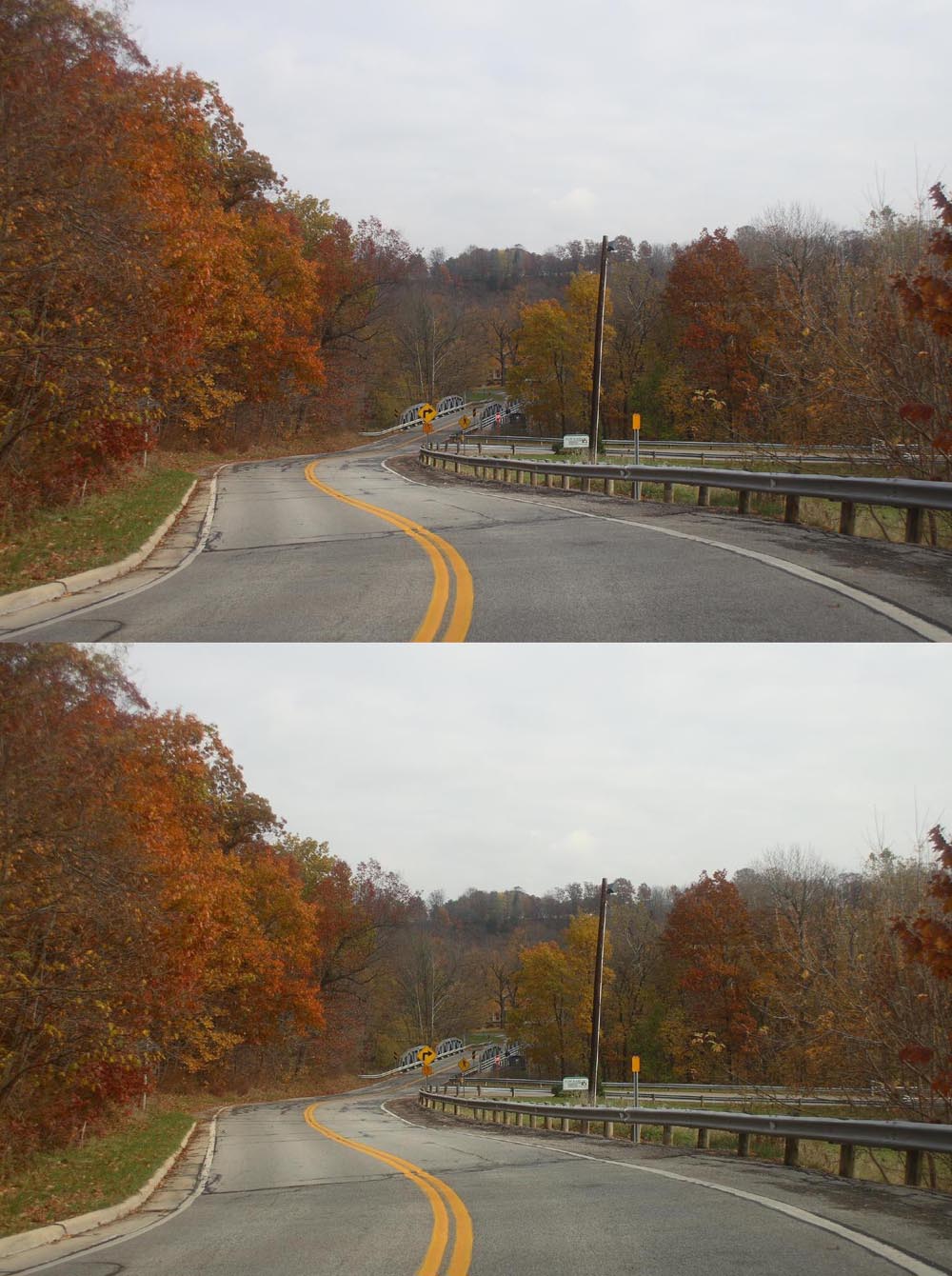
First thing: Examine the picture
This is a lot easier if you just came in from a shoot. Chances are, upon opening the picture, you will notice that the colors in rthe picture probably aren't as vibrant as you remember them.
Option 1: Boost Saturation
By far the simplest operation, boosting the saturation is simply what one can do in Photoshop or the like. Simply find your saturation controller and kick it up a few notches. On DPP, I can take my 30D 4 steps up (increasing saturation) or 4 down (decreasing saturation). In my opinion, a setting of +2 works best as the change is noticeable, but the picture sill looks like a picture, not a painting.


Option 2: Adjust white balance
The reason I love RAW so much is that, should you mess up the white balance setting when shooting, there's no worry, you can just go back and fix it later on the computer. True, when one thinks of white balance, one usually thinks of major mistakes,, such as shooting tungsten under daylight. However, more subtle mistakes can kill your colors. Just by clicking on the correct white balance setting for the conditions in which the picture was shot can help render more vibrant, accurate colors.
The reason I love RAW so much is that, should you mess up the white balance setting when shooting, there's no worry, you can just go back and fix it later on the computer. True, when one thinks of white balance, one usually thinks of major mistakes,, such as shooting tungsten under daylight. However, more subtle mistakes can kill your colors. Just by clicking on the correct white balance setting for the conditions in which the picture was shot can help render more vibrant, accurate colors.

Option 3: Picture styles
Besides white balance, picture styles can have a major impact on color rendition. Obviously for fall scenery, the landscape setting is the best. However, for anyone who demands the greatest accuracy, the setting that is an exact recording of color, 'faithful' in DPP, is another option.
Besides white balance, picture styles can have a major impact on color rendition. Obviously for fall scenery, the landscape setting is the best. However, for anyone who demands the greatest accuracy, the setting that is an exact recording of color, 'faithful' in DPP, is another option.


Option 4: Dynamic range histogram
On DPP, there is a histogram function. While not directly impacting color, the way it plays with the light and dark will have an impact on how color looks. On DPP, moving left will lighten the lights. For color, this will often lead to a loss of saturation, but a generally brighter picture. Moving right will create a darker image, but one that appears more saturated in color.
On DPP, there is a histogram function. While not directly impacting color, the way it plays with the light and dark will have an impact on how color looks. On DPP, moving left will lighten the lights. For color, this will often lead to a loss of saturation, but a generally brighter picture. Moving right will create a darker image, but one that appears more saturated in color.


Option 5: Any combination of the above
While each of the above four techniques can help boost color in your photos when applied correctly, try using any two or even all of them together, one can really add some fantastic colors to fall photos.
While each of the above four techniques can help boost color in your photos when applied correctly, try using any two or even all of them together, one can really add some fantastic colors to fall photos.

Like What You Just Read?
Why not check out other great stuff about photography, astronomy, associated gear, and how to use it.
Think someone else would find this informative (or at least entertaining)? Use the buttons below to share!
Why not check out other great stuff about photography, astronomy, associated gear, and how to use it.
Think someone else would find this informative (or at least entertaining)? Use the buttons below to share!


No comments:
Post a Comment